
ROLE
UI/UX Designer
OVERVIEW
Create a mobile app design for an app providing event information with UGC
DELIVERABLES
Domain Research, Style Explorations, HiFi Mobile Designs, UI Kit, Style Guide
TOOLS
Sketch, Illustrator, Invision
PROJECT LENGTH
Six weeks
Living in a big city has a lot of appeal. There’s always something happening. You can probably find some kind of event for any of your interest on any given day of the week. But how do you find them? It can be difficult to access information like that without doing a lot of research. A solution? Vente, new app that helps you find and RSVP for events in your city.
The aim of this project was to create a design for users who live in a busy urban environment where they can easily find and interact with events nearby. The interface needed to be clean and easily accessible as these users may not have the time to browse the internet or even an app for long periods of time looking for information. Yet, it still needed to be cool enough to catch the eye of users so used to consuming lots of content at once. Simple and cool. You can see a preview of my final design here and more details on my process below.

THE CHALLENGE
The local scene is experiencing an overload of shareable information. Today’s consumers are over saturated with local events, meet-ups, and group activities. Despite the endless sea of happenings, people continue their struggle to find activities that align with their personal interests. For this project, the task was to design a platform that could hold a large quantity of information but organized in a way that wasn’t overwhelming. The user needs to be able to do a quick scan of Vente and find their interests without putting in too much effort. So first and foremost, it needed to be organized, clean and easy to use.
Secondly, Vente is meant for working professionals in their 30s living in a big city. These users are used to taking in content everywhere- their phone, the subway, a podcast, etc. The goal was to make Vente a unique experience that stood out.
At the start of this project, I was provided with UX wireframes for Vente. It included a new user onboarding workflow as well as navigation with home screens for each page. After initial research and a round of user testing, I found that the wireframes could be updated to match the needs of the users. You can check out a deck I made on that here.
Wireframes


To start, I took a look at the current marketplace to identify what visual trends were already taking place in the industry. I identified three direct and three indirect competitors that were used to gain insight on how Vente could stand out. Here are the key takeaways from that analysis:
There seems to be an opening in the market for an application that can be selective and personal for the user while still offering lots of categories and features.
With the study on these six brands, it’s clear that either there’s an overwhelming amount of information, causing it hard to be trustworthy, or the niche is too small to include all users.
Imagery on almost all of the 6 applications was problematic. They were either bad imagery of the actual event, cheesy imagery that represented a category and not of the actual event or no image at all.
Our users are interested in being able to quickly find what’s happening around them without having to spend a lot of time searching. It currently appears to be that there is too much information without a lot of ways to filter or personalize.
THE APPROACH
Design Principles
To nail down my design aesthetic from my analysis takeaways, I created three principles that would influence my future design decisions.
Boldly Memorable
Users see Vente and know what it is. It’s a brand that stands out and users it’s UI elements to be memorable to all who interact with it.
Easily Intuitive
Minimize visual distractions such as too much copy so the user can accomplish their goals efficiently. Include only essential visual elements that have a clear purpose.
Trendy Nature
The interface should feel cool without trying too hard. Users should feel like using Vente is a unique experience that they want to tell their friends about. The design should feel inviting and engaging.
Style Exploration
In order to gain insight into prospective user aesthetics, I created three divergent style directions. I based my designs on our market research as well as well as my own aesthetic. I completed guerilla testing to determine which design to move forward with for high fidelity mockups.
Bold & Trendy


Clean & Geometric


Bright & Simple


Testing Methodology
Objectives
During this project, I conducted desirability and usability testing with my target audience. I gained crucial information that guided the design decisions moving forward. My objective were to determine:
- Does the design help the user achieve their goal efficiently?
- Is the user interested in participating in an event based on the design?
- Does the user find the design motivating?
Audience
The Vente target users are young, busy professionals living in an urban environment in their 30s. They can be previous event regulars or somebody that is interested in going to an event for the first time.
SOLUTION
For Vente, I designed a logo as well as three of the major workflows including onboarding as well as all of the major navigational screens with actions such as RSVPing yes to an event.
Logo Design
Users were really responding to the gradient graphics in my most successful design concept, Bold & Trendy. I wanted to play on that for the logo, keeping the boldly memorable principle in mind. I also was thinking about how during the competitive analysis, the brands didn’t feel trustworthy. I wanted Vente to not only feel cool but also an app that users could feel comfortable attending events they found or spending money to RSVP. That’s why I included the wordmark with the subtle check mark.
The logo can also be divided up into three separate pieces depending on usage.
Onboarding Workflow
For the onboarding workflow, I wanted to stick to the basic idea the wireframes had but modify the design so it was more intuitive. This included making each page consistent with the last creating a flow. Since the onboarding screens have a lot of visuals, I wanted to make sure they were organized in a way that wouldn’t get overwhelming once you begin making selections. Each selection is distinguishable from the categories the user hadn’t selected.
The onboarding of Vente helps the user achieve their goal of finding events they are interested in efficiently. Because of the selections they male (which can be altered in their settings), they will only be shown events that are of interest to them - weeding out a lot of the searching efforts.
I also included a “Welcome” screen as well as a prompt to access location settings from the start. I found that this made the in depth onboarding process a little less jarring.

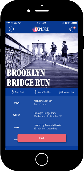
RSVP to an Event Workflow
While the onboarding workflow eliminated any access events that the user wouldn’t be interested in, there is still a lot of content to display. I wanted the user to be able to browse the app in a high level way and be able to find something interesting in a matter of minutes. I designed the screens so that only the most important information is displayed at a time.
On the home screens, the events have a name and a category icon that helps identify what kind of event it may be. There are also content categories such as “Groups in your Area” or “Upcoming Events” to help narrow down the search. Even if viewed in list view, the content is still extremely high level and the visual hierarchy makes it easy to scan.
On an event page, you get more of the information needed for attending the event as well as a few CTAs. You can RSVP, save the event to your “watchlist,” message the host or share with friends. Each CTA has a success message to confirm the action.
Message Workflow
Because our users are young and social people, I wanted to make sure that the app had some kind of outreach element. From any event, you can message a friend or the host. From the bottom navigation, the user can view all past messages or start a new.
This feature also gives the ability to hosts who need to reach out to members who have RSVP’d to their event.

Overall Design
I decided to use these bold colors to catch the eye of a busy user. I also took into consideration the issue with the photography on the sites of the competition. Keeping in mind that much of the imagery to be used on Vente will be user-generated, I created this overly filter to add that essentially ties the imagery together no matter the quality. In this case, even if a UGC photo isn’t a great one, it won’t look contrastingly different from a really good one next to it.


CONCLUSION
I’m very excited to share the final designs for Vente. I achieved the design I envisioned from the start and it seems to really resonate with the target users.
For future recommendations, I would recommend to continue user testing the UX wireframes as well as the visual hierarchy. Is there enough information shown? I would also introduce a map and calendar feature so users can easily sync their events with the rest of their busy lives.
Check out my Style Guide below for more details on my design for Vente.


