
ROLE
UI/UX Designer
OVERVIEW
Create a mobile app design for a micro-volunteering concept using gamification
DELIVERABLES
Domain Research, Style Explorations, Mobile Design Mockups, UI Kit, Style Guide
TOOLS
Sketch, Principle, Invision
PROJECT LENGTH
Five weeks
Today, the average leisure time an employed person has in one day is about 4 hours. Despite this limited period to enjoy extracurricular activities, studies show that volunteering has actually been on the rise. The 2018 Volunteering in America report found that about 77 million adults volunteered that year alone - it was a record high. The evolution of technology has no doubt aided these stats, allowing organizations to connect easily and directly with people seeking opportunities.
From this emerging tech, the concept of “micro-volunteering” was born. The term refers to the idea of being able to volunteer in small doses, whether it’s documenting a pothole you see on the road from your mobile device or contributing to a political candidate you support. It puts you, the volunteer, in control of your contribution: when, where and how you want to help. Micro-volunteers tend to stay invested because of this flexibility and studies have shown that 65% of people who volunteer in this way will still be actively doing so one year later. So how do we bring this concept into the hands of a volunteer? Introducing Voluntopia, a new micro-volunteering mobile app that crowd-sources the users contributions to make a difference in a community. Volunteers can unlock their own utopia, mirroring that of their community, with each task they complete. You can see a preview of my final design here and more details on my process below.


For this project, my team of myself and three other designers, were challenged with the task of designing a platform that would not only engage users to volunteer but to continue doing so long term. We decided to take the concept of micro-volunteering and gamify it. How do we do this? Introduce game-like elements like levels, rewards and social media to motivate a user to continue “playing” - or in our case, contributing to their community.
Our mission was to create an interface that drew users in with a clean design where they wouldn’t get lost in the details. The interface would be intriguing, playful, and somewhat familiar - creating trust. We had creative freedom for our designs with each designer taking divergent routes. We designed and tested with users frequently throughout the project and after several iterations, I developed a mockup of three different workflows that users were excited to interact with.
THE CHALLENGE
At the start of this project, we were provided with UX wireframes for three major workflows: onboarding, completing one micro-volunteering task and inviting a friend to play. The wireframes were used as a starting point for information architecture but each designer tested different versions of the workflows with users to understand what made the most sense visually. We had creative freedom in terms of logo, colors and other UI elements.
Wireframes
We began by taking a look at the current marketplace. We identified three direct and three indirect competitors that we used to gain insight into what the design trends were among them and how Voluntopia could stand out. We discovered during this process that, while there was only one mobile app with the gamification elements, most of our competition seemed to no longer be active companies. From this, we learned that there was a huge opportunity for Voluntopia’s design concept to consider what these brands had done well but to also learn from where they failed.
While only one brand gamified their volunteering tasks, there was no visual cue that you had completed anything, or in other words - no reward. We also noted that while many of the companies used high saturated colors, their interface felt dated and not memorable.
THE APPROACH
Design Principles
To nail down our aesthetic, we created three principles that would influence our design decisions.
Impact Recognition
Users feel great when they volunteer! If we recognize their accomplishments in the app they will more likely to continue using the app to find volunteering opportunities.
Never Noisy
Minimize visual distractions such as unnecessary graphics or lengthy test so the user can accomplish tasks effortlessly. Include only essential visual elements that have a clear purpose.
Guide the User
Use visual cues and indicators to assist users as they navigate the app and complete tasks. Users should always know what to do next and how to progress to the next level.
Style Exploration
In order to gain insight into prospective user aesthetics, each designer created three divergent style directions to test. I based my designs on our market research as well as well as my own aesthetic. I wanted one direction to be clean, one to be playful and one to be bold.
Clean & Simple


Playful Geometric


Bold Color-Block


Testing Methodology
Objectives
During this project, we conducted desirability and usability testing with our target audience. We gained crucial information that guided our design decisions moving forward. Our objectives were to determine:
- Does the design help the user understand the concept of micro-volunteering?
- Is the user interested in participating based on the design?
- Does the user find the design motivating?
- Does the design help the user attain their volunteering goals?
- Does the user feel good about the contribution they have made?
Audience
Our target users were young, busy professionals around the ages of 20-35. They can be previous volunteers or somebody that is interested in getting involved for the first time.
THE DISCOVERIES
The goal of this first round of testing was to gain visual design direction based on the feedback of our style explorations.
For my designs, the testing showed that users really responded to the bold features in all three approaches. While divergent in style and color, they all had an element that made them pop which the subjects really responded to. The most successful style exploration was my third design, the Bold Color-Block. The Clean & Simple design, while easy to digest, was described as boring and needed more to excite. The Playful Geometric design, while users were identifying with the gamification aspects of it, they felt it reared to a younger audience.
Based on this feedback, I decided to move forward with the Bold Color-Block design concept. Users were most interested in a design that was clean but had elements that really stood out. Moving into my high fidelity mockups, I wanted to make sure that I was strategically using color and UI elements to elevate this concept.
Hi Fidelity Design 1.0
The Design
I spent a lot of time analyzing the wireframes to develop a gamification strategy for my high fidelity designs. I wanted something that users would be familiar with but also approach it in a new and exciting way. In our testing, we asked our users what games they play on the mobile device and why. Most users mentioned games like Candy Crush. They noted that, whether subconscious or not, being able to level up on the map was a rewarding experience and kept them playing in their downtime. I decided to take this route, literally, for the structure of my homepage. Users could unlock new buildings in different categories as they played, or completed micro-volunteering tasks. Keeping my design principles in mind, I wanted to show some Visual Impact on the home screen, so I added a feature that unlocks a fact with each building, informing the user how their contribution helps their community.
For this first iteration, I started by designing just the “complete a task” workflow for testing. I wanted to make sure the design was working before I moved on. Each screen was designed with the principles Simply Seamless and Guide the User in mind. I wanted to make sure that there were no blockers in the design while still introducing some of the quirks present in my style exploration.


The Testing
One of the challenges I had in this first iteration was how to strategically use my color scheme from my style exploration. There were comments on how the usage in version 1 felt confusing and dated. After reviewing the testing synthesis, I found that users were not responding to my colors as much as they were to the design approach itself. I decided to take this opportunity and create an entirely new color scheme, using dark UI that I hadn’t seen in the competition, and complete guerilla testing. The results were overwhelmingly positive for the new color palette.
Users were also having problems with some of the layout decisions I made with headers. They felt like the slightly off the line idea looked like it wasn’t intentional and could be a mistake in the design.
I took this feedback and decided to clean up the header design and use my new colors in a way that guided the user through the app instead of adding confusion. I assigned each color to a function before I started designing and felt that this helped with the end result immensely.

THE SOLUTION
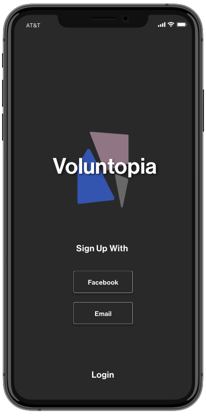
For Voluntopia, I designed a logo as well as three of the major workflows including onboarding, completing a micro-volunteering task and inviting a friend to join Voluntopia.
Logo Design
The design for my Voluntopia logo mirrored the concept of micro-volunteering. Together, many small tasks from a community can make a great impact. The design represents a mosaic of a community, or building blocks, coming together to help the greater good.
Onboarding Workflow
For the onboarding workflow, I experimented with animations that guided the user through the process and foreshadowed the design to come. With four screens, I wanted to engage the user to not skip ahead and be interested in reading about what Voluntopia has to offer.

Complete a Task Workflow
The homepage was the most challenging screen to design. Playing off the version 1 design, I tweaked the route to feel more like a game. I spent some time looking at other apps that use this strategy and noticed that having some kind of illustrations to help guide the users eye through the levels was a simply seamless way to decrease confusion. The vibrancy of the color on the route showcases where the user is in the game as well as the “locked” buildings ahead. Users are able to toggle through different categories such as civic tasks, educational or health, each with their own route to complete. I decided to separate these verticals so users felt like there was always a new category to explore. The animated location marker was a secondary way of informing the user of their current achievement, as opposed to just the color of the route. Keeping my design principles in mind, I wanted to show some visual impact on the home screen, so I added a feature that unlocks a fact with each building, informing the user how their contribution helps their community
As the user navigates through the task, I used color to highlight important information as well as active states. Once a user completes a task, they are rewarded with another animation showing their visual impact as well as a motivational message and CTA to keep playing. Users responded well to this, stating that they felt like they were really making a difference with this small task.
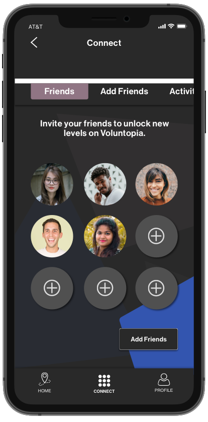
Add a Friend Workflow
For the social aspect of Voluntopia, I wanted to keep the interface fairly straight-forward. With every nine friends you invite, you unlock a new world (or category). The icon in the navigation is a representation of those nine friends. The top toggle works in the same was as the map screen, giving you the option to see your current friends, add more or to see how they have been interacting with the game.


CONCLUSION
While I struggled with my early designs, I learned a lot about iterations during this design process. I listened to what users were saying and applied that to my screens resulting in a product I am really excited to share.
For future recommendations, I would begin by working with the UX team to revisit the wireframes. During testing, we found that there were some issues with usability such as the task instructions being too wordy or an explanation of what “fully, partial or not accessible” meant.
In terms of my design, I would like to iterate on my homepage design and push it further. I would like to test introducing a progress percentage on the screen, as seen in the reward animation when a task is completed. I also would like to play around with the animations to elevate the excitement factor.
Check out my Style Guide below for more details on my design for Voluntopia.


